
Product Designer/UX Designer
Sentral
Reservation Lookup Product
Before delving into the development of our reservation lookup app, we encountered a multitude of backend technicalities and validated user pain points. The impetus for this project stemmed from customer feedback, highlighting the challenge of accessing reservations easily, compounded by a 35% return customer rate.
Recognizing the need to enhance our repeat purchase rate, we embarked on a journey of research and discovery. Our objective as user researchers was clear: understand user pain points, stresses, and thought processes throughout the booking and stay experience. To achieve this, we conducted extensive user testing involving both current residents and frequent travelers. Through interviews and rating exercises, we gleaned invaluable insights that solidified our findings.
The must-have features for both guest and resident portals were meticulously identified, ranging from reservation management to personalized interactions and community access. Additionally, we recognized the importance of catering to prospects, offering functionalities such as scheduling tours and lease initiation.
With these objectives in mind, I crafted a comprehensive flow chart to visualize the seamless integration of these elements. The implementation of this new information was facilitated through a login on the Sentral.com platform, bridging the gap until the development of a native application.
-14.jpg)
The initial MVP focused on delivering a simple yet effective solution for reservation lookup and modification. Despite challenges with system compatibility, we devised creative solutions to ensure a smooth user experience. Subsequent iterations and testing refined the product, culminating in the evolution of the reservation lookup app into a robust customer portal.
The project yielded significant impacts, with notable increases in booking rates, task completion, and revenue. User feedback underscored the success of our efforts, praising the intuitive navigation and clean UI. Personally, I found immense satisfaction in contributing to this project, witnessing firsthand its positive outcomes and seamless user experience.


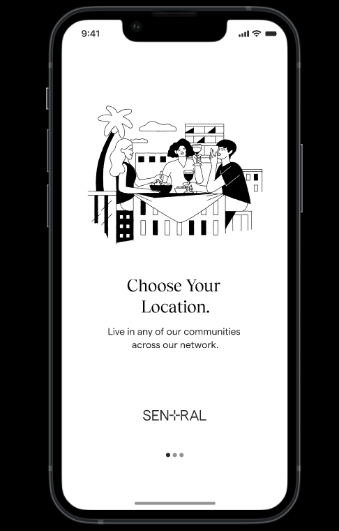
Resident App
As part of a cross-functional team consisting of myself, a product manager, and developers, I played a pivotal role in the development of the Resident App for Sentral, aimed at catering to our long-term rental personas. Over a period of three months, we operated within two-week agile sprint intervals, adhering to UX best practices and methodologies throughout the process.
My responsibilities for the Resident App encompassed a wide array of tasks, including facilitating research, ideation, component creation, prototyping, user testing, engineering support, and quality assurance.
To kickstart the process, we conducted extensive user testing to ascertain the preferences, needs, and pain points of our customers. This involved interviewing 10 current residents of our properties, gathering valuable insights through voting and rating exercises to inform our design and development decisions.
The Resident App was designed to meet essential resident portal requirements, including functionalities such as rent payment, service request management, lease agreement viewing, package management, profile information updates, and personalized booking options. Additionally, residents could access specific community information, request services, and stay informed about community announcements.
In addition to catering to existing residents, we also aimed to provide a seamless experience for prospects. Thus, the app featured functionalities for scheduling tours, viewing unit details, and initiating or completing lease applications. Through meticulous planning and execution, we ensured that the Resident App met the diverse needs of both residents and prospective tenants, enhancing their overall experience with Sentral's residential properties.
"As user researchers, we want to understand our users pain points, stresses and thinking processes of the current booking and stay experience."
Property Management HUB
I collaborated with a cross-functional team consisting of myself, a product manager, and developers to spearhead this initiative. Over a period of ten weeks, we operated within two-week agile sprint intervals, ensuring rapid progress and iteration.
In my role, I undertook the task of analyzing data and research findings to develop an internal hub aimed at enhancing the efficiency of day-to-day operations for property managers and various operational and facility team members. Working closely with team members from different disciplines, I assumed a leadership role in crafting the user interface (UI) for a dashboard that would centralize information from multiple backend sources.
This involved various stages of the design process, including logo and icon creation, component development, low-fidelity prototyping, high-fidelity prototyping, user testing, engineering support, and quality assurance (QA). The end result was a set of screens that effectively displayed pertinent information in a clean and functional manner, facilitating streamlined workflows for team members. Below are examples of some of the screens created during this process.


Desktop & Mobile Web Re-Design and Brand Positioning
Working with Sentral was a unique journey characterized by complexity and innovation. As a company operating at the intersection of apartment management and short-term rentals, Sentral presented novel challenges that required inventive solutions. My role as a product designer was pivotal in reshaping the user experience, particularly in redesigning the booking flow for the dot-com platform.


The story began with a realization of the challenges we faced. Through extensive research and discovery, we identified our primary objective: to understand how users perceive our brand and streamline their booking experience. Surveys and user testing revealed significant confusion among users, indicating a pressing need for clarity and simplicity in our interface.
Analyzing data from Google Analytics and Fullstory further confirmed the complexity of our user journeys and highlighted the need for targeted interventions. Our objective was clear: reposition the brand and create a more intuitive booking process.
To achieve this, we delved into the mindset of our users, identifying three key personas: the mobile professional, the modern traveler, and the urban dweller. Concurrently, we balanced business objectives, preserving revenue streams while optimizing the user experience.
Our strategy unfolded through a series of sprints, each aimed at addressing specific design challenges. From crafting an information architecture diagram to delivering final design options, every step was meticulously executed to align with stakeholder expectations and user needs.
However, challenges arose, including accessibility issues, confusing toggles, and selection errors. Despite setbacks, we remained agile, iterating on designs and pivoting when necessary. One significant pivot involved rebranding our messaging to eliminate the terms "live" and "stay," requiring a creative rethink of our approach.
In the end, our efforts bore fruit. Metrics reported a substantial increase in revenue, a testament to the impact of our design interventions. While we encountered obstacles along the way, the journey was rewarding, knowing that our work ultimately improved the user experience and contributed to the company's success.


